Before we start, if you wish to view a video walkthrough I created for the seismic program SWARM then please watch the video below. You can visit it on my YouTube channel if you CLICK HERE. The text below the video is the description box containing information, a parts section, and links.
If I told you to use Microsoft Paint to create custom plot images, please DO NOT! I found an easier and faster way. Simply look at the video directly below this one.
If I told you to use Microsoft Paint to create custom plot images, please DO NOT! I found an easier and faster way. Simply look at the video directly below this one.
Please utilize the parts sections below if this video is too long for you. This video is meant for the “…use SWARM” page which resides under the “How To” menu on my website. This video is a walkthrough of how I use SWARM everyday. Remember I am not a professional and there are still aspects of the program SWARM that I do not fully understand. I hope this helps some of you and lets start monitoring volcanic and tectonic hazard areas with ease and accuracy!
Parts:
00:01 – Intro/About SWARM
06:22 – Downloading/opening SWARM
12:49 – A look at the many settings for viewing data
25:07 – How to add a filter to the data
28:33 – Saving helicorder images/How to change helicorder scale
32:17 – Additional stuff
35:45 – How to live stream individual channels via SWARM
39:26 – How to live stream many channels at once via SWARM
42:58 – How to create custom plots via SWARM
48:27 - Conclusion
Links:
SWARM download: https://volcanoes.usgs.gov/software/swarm/download.shtml
IRIS DataSelect: http://service.iris.edu/fdsnws/dataselect/docs/1/builder/
Data link to July 5, 2018 swarm: http://service.iris.edu/fdsnws/dataselect/1/query?net=WY&sta=YLT&loc=01&cha=EHZ&starttime=2018-07-05T00:00:00&endtime=2018-07-06T00:00:00&format=miniseed&nodata=404
Email: [email protected]
The video directly below will show you how to quickly generate professional looking seismic plots from the program SWARM. Please CLICK HERE to visit this video on YouTube if you wish.
Adding Data:
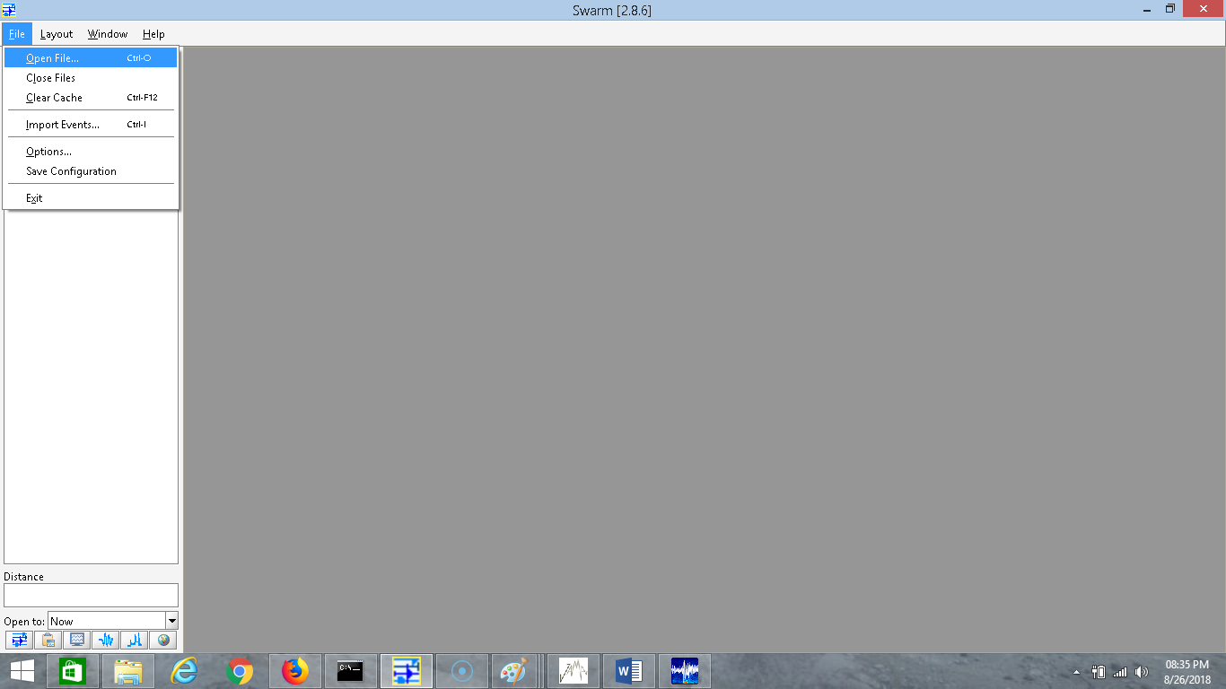
On this page I will give a simple walkthrough on how to use the program called SWARM. SWARM was created by the Alaska Volcano Observatory in conjunction with USGS. It is an amazing seismic analysis tool that I use every day. It is also the same exact program Spectronet, kiwiquakes, and Orange Ribbon Hope uses to stream live spectrograms or waveforms. It can do much more than stream data however! I will show you an example of how to stream data from IRIS, but first I want to show you how to add seismic data you have downloaded. To download SWARM please CLICK HERE. For a more in depth user manual, please CLICK HERE. For the IRIS DataSelect URL builder, the tool I use to download seismic data, please CLICK HERE. You can also goto "links" in the "more" dropdown menu to find other data services including the IRIS TimeSeries URL builder which can help you do many things including filtering data (which is also provided in SWARM) or downloading seismic data in audio format so you can hear seismic events. Seismic audio is really cool!
Once SWARM is downloaded, it must be unzipped. If you do not have a ZIP program, Google "7Zip". It is completely free to use. Once unzipped, simply click the folder and click "swarm_console". A black window will pop up and then the program will open. Minimize the black window but keep it open. It is how the program works. Now you are ready to begin using SWARM.
The first time the program is opened, there will be some random images. Simply click out of them if you wish. I have a sample .SAC file to download for anyone who wishes to go through this walkthrough with me. It will be quick, so if you wish for a more in depth explanation for how to use this program just read the user manual. The sample download, which you can find by CLICKING HERE, is some of the seismic data for the 2008-2009 dike intrusion event at Yellowstone Lake from seismic station LKWY BHZ. You can see a few low frequency events in the mix, possibly indicative of magmatic resonance. I won't show them here but you can see many plots for this event under "seismic events" and in the "2008-2009 Yellowstone Lake" page.
SWARM has 3 main seismic analysis options which I find are wonderful and easy to use. SWARM allows you to analyze seismic data through seismograms (waveforms), spectrograms, and frequency spectral analysis. SWARM can even aid you in creating your own helicorders! SWARM can also open many different types of seismic data formats including the popular SAC (.SAC) and Miniseed (.mseed) formats. Downloading seismic data and analyzing seismograms, spectrograms, and spectral analysis plots are way easier than what some people on YouTube would have you believe. This way you can monitor any area you want, any way that you want. Boy, did I feel an overwhelming sense of freedom when I discovered I could do this stuff! And the best thing about the seismological community? Pretty much everything, especially seismic data, is free and shared!
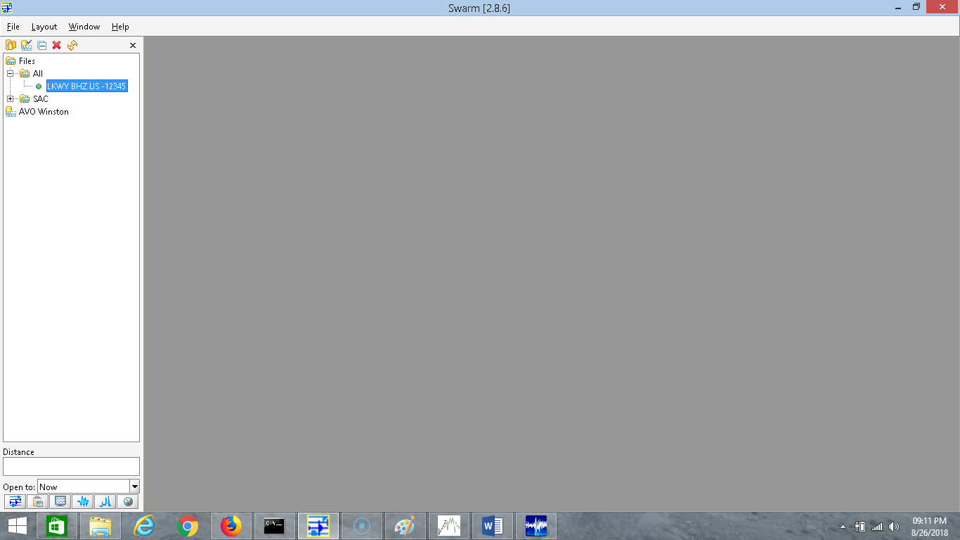
So after you have downloaded the sample data (you can also use any .SAC or .mseed data you have on hand) goto "file" and "open file" and, of course, open the file of your choosing. Once double clicked, it will take a second to load and then you will see the station name pop up on the left side as shown in the image directly below:
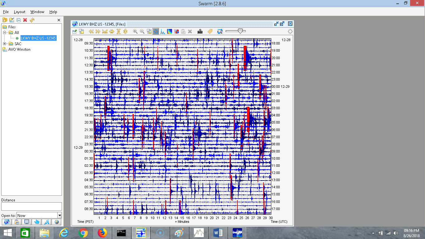
Go ahead and double click any source you want. In this case, the only source is LKWY BHZ US. Now if you had additional data for the exact same station and channel, you can open it and it will automatically add it to the source on the left. So double click the source and it will open up a clipboard as shown below:
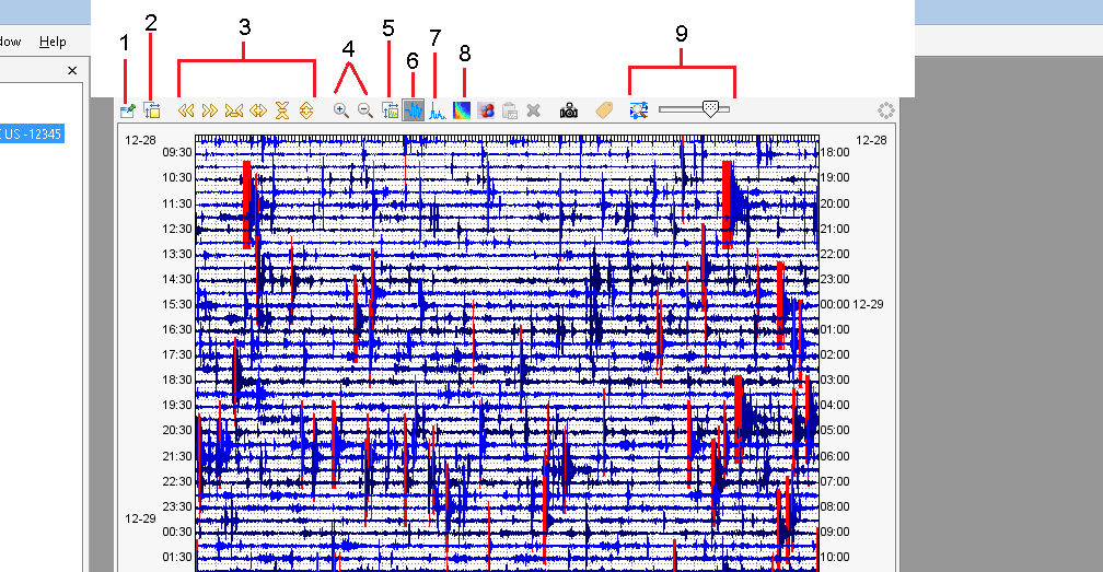
9 frequently used clipboard options. The camera icon simply takes a webicorder screenshot.
Now on this program SWARM, the window that pops up after double-clicking the data source is called a clipboard or a helicorder. Here labeled are the 9 clipboard options I use.
1. This option makes sure this clipboard, or helicorder, is always on top. No matter how many clipboards you have open.
2. Helicorder settings - This option opens the settings to manipulate the helicorder clipboard. I will talk about these settings and about #5, wave settings, in just a second.
3. The first two arrows, pointing left and right, are time navigation. The other four arrows manipulate the time frame of the helicorder clipboard, both width and height (amount of minutes per seismogram line & amount of hours allotted for the helicorder). The four arrows do not have to be used if you are used to manipulating the time frame using the "helicorder settings".
4. When you are viewing the data using #6, 7, and 8 (waveform, spectra, and spectrogram) analysis options, these magnifier glasses either zoom in or zoom out of the analysis window. If it does not zoom in enough on the analysis window, you could always select an area of the window you want and it will zoom in to that selected area.
5. Wave settings - #2, helicorder settings, and #5, wave settings, will be talked about more in depth in just a second. Wave settings are important because these can manipulate how data is viewed for all three types of analysis options (waveforms, spectra, and spectrograms).
6. Waveform analysis - #6, 7, and 8 are the analysis options I use. This option is seismic waveform analysis. Whenever an analysis option is selected, you then must click an area of interest within the helicorder to open the analysis window.
7. Spectra analysis - This option is the spectra analysis. This allows you to see the power of each frequency within the window you have selected.
8. Spectrogram analysis - This option is for spectrogram analysis. This shows frequency range and time period. Power is color coded. Blue is weak and red is strong. Spectrograms, contrary to what some may think, are very easy to understand and read. However interpreting what a spectrogram is showing is harder especially when you think you should only use spectrograms! I tell you now that it is best to use a combination of all three seismic analysis options.
9. Clip/Amplitude option - Now this option allows you to either increase or decrease the clippings on the helicorder. It also allows you to elongate or shrink the amplitudes on the helicorder. Use the scale to manipulate. The button just to the left of the scale is what switches it from clipping scale to amplitude scale. This option seems to be a little glitchy at times.
I seem to have forgotten to number the camera icon. The camera icon, just left of the clip/amplitude option scale, is to create a helicorder screenshot. However it is more like generating a real helicorder than just a simple screenshot. It will image whatever the current helicorder is showing. This is what I use to create almost all of the images within my seismic image archive for Lassen Peak, Long Valley, Mt. Rainier, Newberry, and Mt. Hood volcanoes. You can even choose the size, both width and height, of the helicorder you are saving.
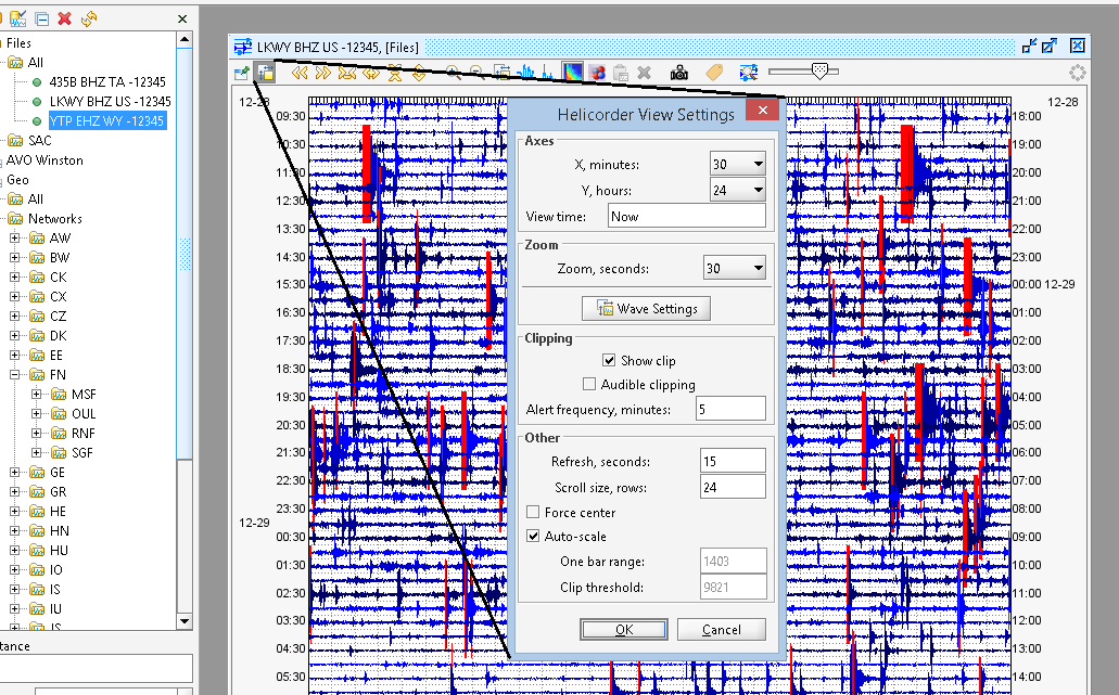
Here are the helicorder settings. Where it says "Now" is usually the time of the helicorder you have open. You can use this to center on a certain date and time if using the arrows is taking too long. Sometimes it glitches and says "Now" even though you are obviously not living in 2009 (which is when this helicorder shown above was taken). The only option I use here is the axes options: X, minutes and Y, hours. Manipulating "X, minutes" changes the amount of time per line (seismogram) and manipulating "Y, hours" changes the amount of hours allotted within the helicorder. This is why pulling up data on SWARM is a lot better than viewing the online webicorder images. This program really gives you alot of freedom! Also, the button that says "wave settings" is the same option as #5, shown in the example above this one. I will show those settings now:
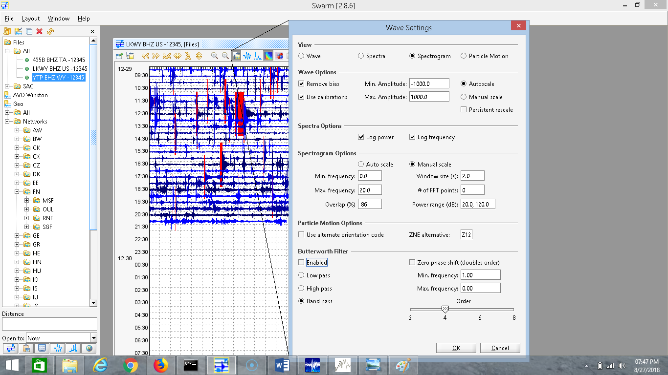
Here are the wave settings. In the wave options, within wave settings, you can do a few things. If you have autoscale selected and persistent rescale selected as well, when using the waveform analysis window (#6), the scale of the seismogram changes with the amplitude (the height of any given waveform) so no amplitudes go beyond the window frame. However if you do have persistent rescale selected, when viewing smaller amplitude activity right after large amplitudes, the scale would not change. This frustrated me at first, since back then I did not know how to change it. Now whenever I open seismic data in SWARM, I always go to wave settings and uncheck persistent rescale. Having it unchecked will perfectly allow you to see all amplitudes without any going beyond the analysis window frame. Simply put, it will scale perfectly to whatever activity you are viewing.
Now if you want a specific amplitude range, please select manual scale. Then look just to the left and manipulate the minimum and maximum amplitudes of your choosing. It is suggested, regardless of number chosen, that the minimum and maximum amplitude counts are equal to each other. For example, -500 and 500 or -850 and 850, -9239 and 9239, etc...
The next option section is for the spectra analysis window (#7) and it only has two options. I highly suggest not changing these, except the one that says log power. HOWEVER BEWARE!!!!! If log power is unchecked in the spectra options and you try to view an actual spectrogram, for some reason it will glitch and the spectrogram won't even look like a spectrogram! So whenever you use the spectrogram analysis window and it does not look right, make sure "log power" is checked in the spectra options. I'm pretty sure it is a glitch which I hope gets fixed soon.
Now we are at the spectrogram analysis window (#8) options. You will notice manual scale is the default setting for the spectrogram options, opposite of the default setting for waveform options. You can select auto scale if you wish, but in my experience "manual scale" is a better option for the spectrograms. Now I usually change the "window size" option to 1.0 right away, instead of 2.0, but that is just a visual preference of mine. You can also manipulate the frequency range that the spectrogram analysis window will show (I suggest 0-20HZ, as is the default). You can also change how the power is recorded as well.
Particle motion options are for the particle motion analysis window. It is right next to the spectrogram analysis window button (#8). I actually never use particle motion since, to be honest, I have no idea how it is supposed to work. Some day soon that will probably change. But for now, I am cool with what this program has given me and others as well!
The last option is the butterworth filter. This is used to filter data in a multitude of ways. First, if you wish to add a filter to the analysis windows, make sure "enabled" is checked before pressing OK. Now there are three options for filtering seismic data. I was confused with this at first, but once I figured it out it has been very helpful. You will notice there are three filter options on the left with two text boxes on the right. These three filter options affect all three seismic analysis windows: seismograms (waveforms), spectrograms, and spectral analysis.
-Low pass filter: A low pass filter simply allows the user to view frequencies ONLY below what you want. For this filter option you only need to change the box that says "Max Frequency". For example if you have "enabled" and "low pass" selected and you enter 2.00 in the "Max Frequency" box it will only show frequencies below 2HZ and that is it. These are very simple to understand.
-High pass filter: This is similar to a low pass filter except that it works in exactly the opposite way. For this option you only have to worry about the "Min Frequency" text box. A high pass filter simply allows you to view frequencies above what you have selected. For example if you have "enabled" and "high pass" selected and you enter 2.00 in the "Min Frequency" box it will show all frequencies only 2HZ and above. Notice how it is exactly the opposite? Now what if you don't want either filter but want to set a frequency range of your choosing? If so, the band pass option is the one for you!
-Band pass filter: Now this one is easier to understand. This, when enabled, will allow you to see frequencies only in the range you have selected. This time you must pay attention to both text boxes (Min Frequency and Max Frequency). For example if you set 1.00 Min Frequency and 10.00 Max Frequency then, while viewing seismograms, spectrograms, or spectral analysis, it will only show frequencies between 1HZ and 10HZ. Starting to get the picture?
The butterworth filter is very helpful especially when trying to filter out very low frequency background noise (microseisms). Whenever I am viewing broadband station data, since broadband records very low frequencies as well, I like to enable a 0.7HZ High pass filter before analyzing the data. This will make the analysis "look" like a short period instrument simply because short period instruments usually only record frequencies above 1HZ while broadband stations record all frequencies. This is why global large earthquakes (teleseisms) appear "stronger" on broadband stations.
Streaming Seismic Data to SWARM:
Ever see people on YouTube, such as Spectronet, Kiwiquakes and others, streaming live seismic data or heard about the possibility and want to do it yourself? Well here I will NOT teach you about how to add the data to a live YouTube stream, but instead how to simply stream seismic data from the IRIS network to the SWARM program. There are a few other ways to stream data to SWARM, but I will show you one way I do it.
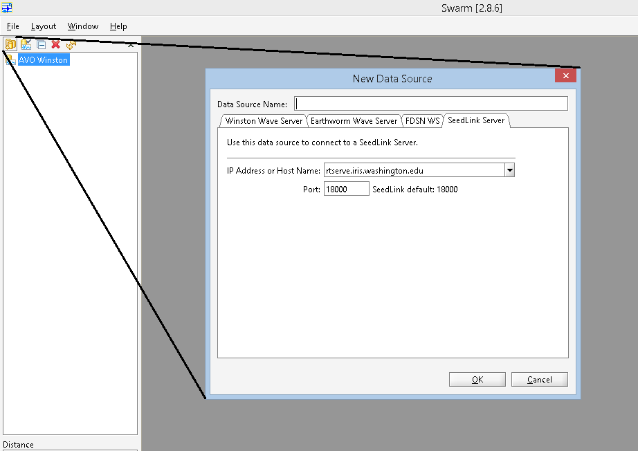
To start, please click the icon that I am showing in the image above called "new data source". It will open the window shown above. Go to "SeedLink Server" and select the "IP address or host name" that is shown. This will be the IRIS DMC database that is responsible for many seismic networks including the network that covers Yellowstone, WY. Once that is selected, please do not change the port number and simply press OK. However, you cannot press OK until you have named the source. The name can be anything you want, even "walakazam". But I like to name it IRIS. Once you press okay, it will add it to the list on the left. You will see what I mean in the image directly below. Please double-click the source that has been added and wait a minute or two while it says "opening...". Just a heads up, sometimes a glitch may occur. If this does not work, please quit the program and try again.
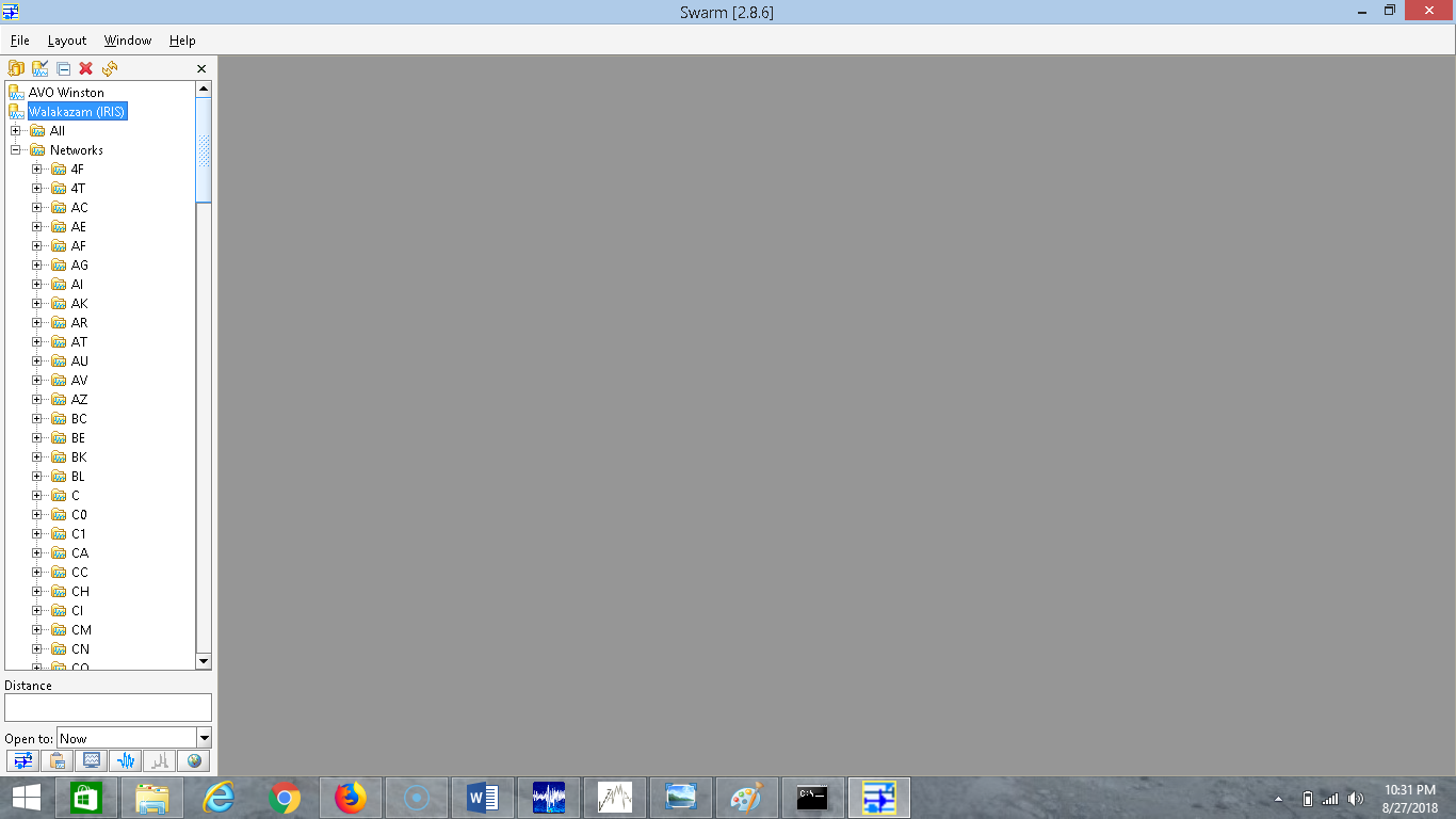
Once it is done opening, you will see two options: All or Networks. Now you can select All if you want, but you are going to have to sift through thousands upon thousands of seismic stations and channels. In my experience, selecting Networks is a better idea. Now let's simply add one of the example sources I used for the jAmaSeis walkthrough, YMC. YMC, a seismic instrument which resides within the WY network which monitors seismic activity at Yellowstone super-volcano in Wyoming, stands for Maple Creek. So scroll down and double-click WY (or you could just click +). Then find the seismic station you want, in this case YMC. Please open YMC.
You will notice there are 3 options available after you open YMC. YMC only has one short period seismic instrument. Of course, like most seismic instruments should, YMC records 3D ground motion. Notice how the three options look the same? Except the ending is either E, N, or Z? Well the last letter is the only thing that changes. Therefore that shows us YMC only has one seismic instrument which records short period activity for east-west (E), north-south (N), and vertical up-down (Z) ground motion. For our example we want short period vertical, so please click YMC EHZ WY 01 just once!
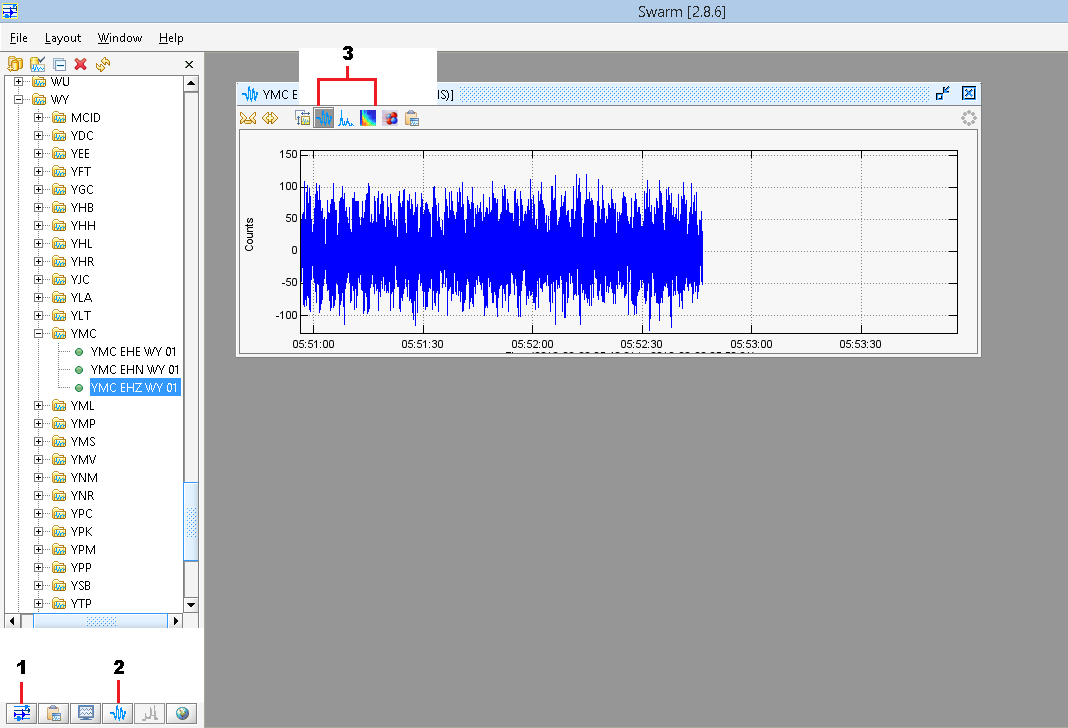
Now clicking it twice will open up #1, which is labeled in the image directly above in the bottom left corner. This will open a helicorder image on a clipboard showing the seismic data acquired from live streaming the seismic source. That is not used as much as option #2. Simply click the source you want just once, in this case YMC EHZ WY 01, and click the button labeled as #2 in the image above. It will then open a window like the one shown.
Once that is done, you can do this as many times as you want with as many seismic sources as you want! In the image above, #3 simply shows you can change the view from waveform (the one currently shown), spectra, and spectrogram. The one commonly used for YouTube live streams is spectrogram view. The first two arrows within the window allow you to "zoom in" or "zoom out" of the window.
What are the red marks on online seismic charts? Why do the size of the events seem to change when bigger activity is seen?
Well to start, there is such a thing called re-scale. The data itself is never manipulated but only how it looks. Some online webicorders use this and when you see a large 6.0 quake at Yellowstone, you will notice some of the smaller quakes (that would usually look bigger) look smaller. I used to think this was done intentionally but I then realized it was an automatic response to incoming data that was much larger. This is called re-scale and can be done in many different ways on the program SWARM (or completely removed if you wish).
Now the red marks you may see on any helicorder or online webicorder are amplitudes that have been clipped because they went beyond a pre-set margin. This is so no smaller activity is completely hidden by large "spikes" many earthquakes can produce. However BEWARE! These marks are not for earthquakes only! Any amplitude regardless of the source that goes beyond the pre-set setting will be cut. Whenever it is cut, it is marked in red to notify you the amplitudes have been cut on the chart. Please note that this does not affect the data in any way, shape, or form. If you would like a few examples, please watch the quick 3 1/2 minute video directly below. There is no sound but there is text so you will understand what is going on.
Now the red marks you may see on any helicorder or online webicorder are amplitudes that have been clipped because they went beyond a pre-set margin. This is so no smaller activity is completely hidden by large "spikes" many earthquakes can produce. However BEWARE! These marks are not for earthquakes only! Any amplitude regardless of the source that goes beyond the pre-set setting will be cut. Whenever it is cut, it is marked in red to notify you the amplitudes have been cut on the chart. Please note that this does not affect the data in any way, shape, or form. If you would like a few examples, please watch the quick 3 1/2 minute video directly below. There is no sound but there is text so you will understand what is going on.
Well I hope this walkthrough was simple enough. Again, if you wish to view a more in depth user manual please look at the top of this page. If anything is missing or incorrect, please do not hesitate to contact me!