Hello there! This page will teach you how to understand spectrogram plots. It will show you what spectrograms are, how they are to be read, and what activity they show. If you would like a video explanation, please CLICK HERE to visit my video on YouTube. However, this page might be better than that video.
-What is a spectrogram?
Spectrogram plots are gaining in popularity. Not only with amateur earthquake enthusiasts, but also in the field of professional seismology. They can be shown in many different ways. However, there is one thing that remains a constant: seismic data. There is no such thing as spectrogram data or seismogram data. There is only seismic data (wave data).
Spectrograms show the frequency of waveforms (waveforms constitute a seismogram/waveform plot) in relation to time and amplitude (power). They can be used to determine specific frequencies, when those specific frequencies occurred, and at what strength they occurred at. On this page, I will show you how easy it is to understand spectrograms and how to read them.
If you wish to see the simple explanation on spectrograms, given by the Pacific Northwest Seismic Network (PNSN), then please CLICK HERE. They create online spectrograms for viewing from seismic stations all around the Pacific Northwest. However, the many characteristics of their spectrograms, such as frequency range, power, and time period, cannot be edited. If you use the seismic program SWARM, the program I used to generate all the plots on this page, you can edit all of those features so you may view the data how you wish to view it. The data itself is never manipulated, only how it is shown.
TIMES ON ALL PLOTS IN UTC!
Spectrogram plots, like the one shown above, show frequency range vertically, time period horizontally, and a third dimension is signified via color (blue shows the weakest energy and red shows the strongest). Proof of this is shown later on this page. So, what does this spectrogram plot show us? It shows us this M2.0 had strong energy beneath 5Hz or so that lasted longer than 15 seconds. However, strong energy did reach about 20Hz.
There are many misconceptions and misinformation out there about spectrogram plots and what they show. I will address those now. One of the misconceptions is that spectrogram plots can show "melt depth". This is incorrect. Look at the label on the left of the image. If this were showing any type of depth whatsoever, it would have a depth label in kilometers, miles, etc... It clearly says "Frequency (Hz)".
Another misconception is that lower frequencies show the event occurred much deeper. That is also not true, see that frequency attenuate (drop) with great distance. A wonderful example of this is shown at the end of this page when I talk about teleseismic signatures.
Remember, don't just take my word for it. Try all of this stuff out for yourself!
-Do spectrogram plots really show waveform frequency?
Yes. Spectrogram plots show how often waveform spacings (periods) occur. This is why low frequency earthquakes are often called "long period" earthquakes because the periods of waveform spacings are much longer than seen in a high frequency event. Frequencies themselves have nothing to do with any depth of an event. For example, the low frequency earthquake below resides at a much shallower depth than the high frequency earthquake. Again, spectrogram plots have nothing to do with depth.
Yes. Spectrogram plots show how often waveform spacings (periods) occur. This is why low frequency earthquakes are often called "long period" earthquakes because the periods of waveform spacings are much longer than seen in a high frequency event. Frequencies themselves have nothing to do with any depth of an event. For example, the low frequency earthquake below resides at a much shallower depth than the high frequency earthquake. Again, spectrogram plots have nothing to do with depth.
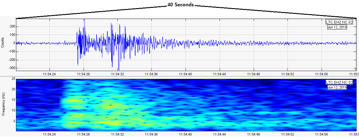
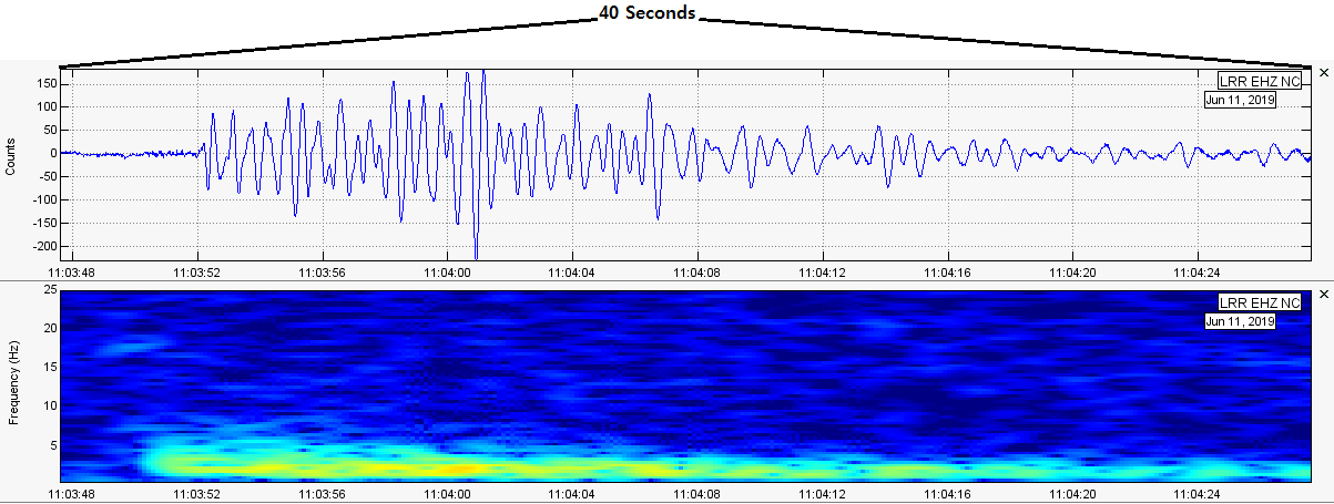
Notice the two images above? Each image shows a seismogram/waveform plot (top) and a spectrogram plot (bottom). Both images show the exact same time frame: 40 seconds.
First, take a look at the high frequency earthquake. Notice how the waveform spacings (periods) are much closer together and the frequencies on the spectrogram plot shows high range frequencies?
Next, take a look at the low frequency earthquake. Notice how the spectrogram plot is showing much, much lower frequencies? Well, take a look at the waveforms. Notice how the waveform spacings (periods) are much farther apart? Frequencies rarely go beyond 6Hz for this low frequency event, while the high frequency event saw strong power all the way up to 15-20Hz!
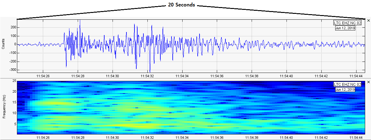
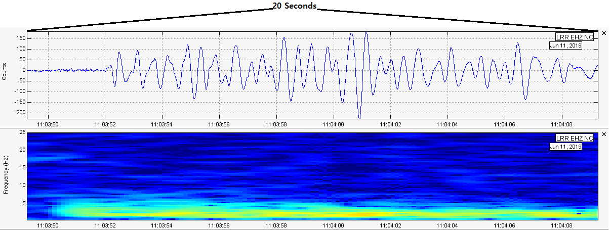
Here is a closer look at these two events (the two images below). Again, notice the waveform spacings (periods) directly correlate with how the frequencies are shown on the spectrogram plot. Again, there is no such thing as spectrogram or seismogram data. Only seismic data (wave data) remains the constant. There are simply different ways to view the same type of data.
Notice how the time period for both images is the same (20 seconds)? Well, take a look at the low frequency event. Notice how the waveforms are much farther apart? The waveforms of the low frequency events have longer periods than the high frequency event, therefore making them "less frequent", therefore showing it was a low frequency event.
-Do spectrograms show gas discharge or magma?
No. This is a common misconception put out by certain individuals on the internet. As proven here, the color range you see, which is considered the third dimension of a spectrogram plot, simply shows amplitude (power; strength). This allows you to see what the strongest frequencies were when they occurred, at the exact levels that strength occurred at, and how long it lasted for. Spectrogram plots are very powerful in conjunction with other forms of seismic analysis.
First off, if spectrograms were to show magma itself, supposedly represented by the color range you see, then the whole planet would have magma right at the surface. This is because strong earthquakes, for example if one occurred in Canada, New York City, Seattle, Washington D.C., etc..., will always show a great deal of "red". Again, the color range signifies amplitude (power; strength).
Secondly, is it possible for spectrograms to show gas via color? Again, no. Not only do seismic stations not detect any type of gas or chemical compositions, this would tie in directly to the label on the left, seeing any change that occurs vertically would have to correlate with the label on the vertical axis. However, as already shown, the label on the vertical axis, on the left, says "Frequency (Hz)". If it could detect gas or chemical compositions, it would have to be some type of unit of measurement.
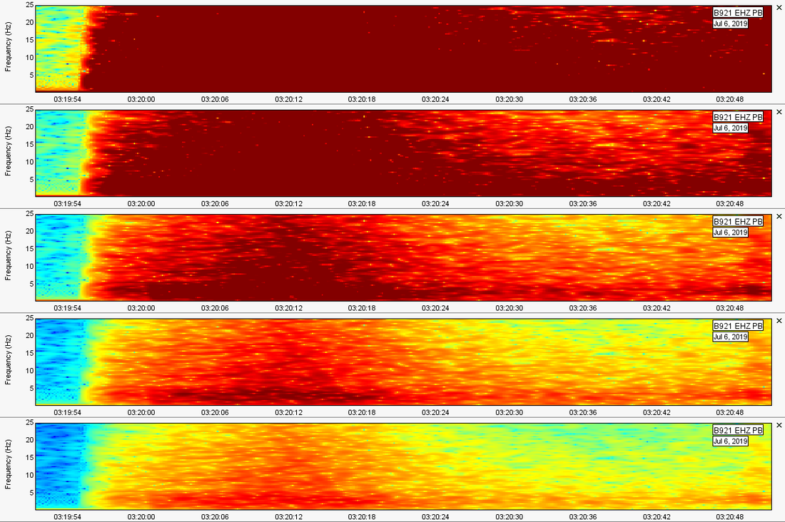
To prove this, above are the spectrogram plot options in the seismic program SWARM. Please note where it says "Power range (dB)". In the image below, I subsequently extend the maximum power range from 110 by increments of 20 units. In the image below, we see the same exact event (this can be proven by the time, date, and station label). However, notice how the color seems to get "weaker" further and further down the image? This is because I edited the power range. Again, this proves color range is simply amplitude (power; strength).
-What are teleseisms? And can they be shown via spectrogram plots?
Teleseismic signatures, a.k.a. teleseisms, are signatures recorded on a seismic station of a large global earthquake. Typically, these would be any signature of a M5.5 or above on a seismic station greater than 1,000km away. And yes, they can be shown on spectrogram plots. This is because seismic stations can detect large global events. Whatever a seismic station detects, it can be viewed via the many plots options available, even spectrogram plots.
Teleseismic signatures will always have very low frequencies, typically below 1Hz or so, and will always appear at least 5 minutes or so from the earthquake's originating time. Seismic waves travel differently through different parts of the earth, so time may vary. However, the frequencies of teleseisms are so low because frequencies attenuate (drop) with great distance.
Below are two spectrogram plots showing the same exact event: the M7.1 near Ridgecrest and the Coso Volcanic Field in CA. Although they are showing the same exact event, one seismic signature is considered a local signature and one is considered a teleseismic signature.
Please note the time range and maximum frequency is exactly the same for both plots. However, notice B921 (the top image). It shows some very strong high frequencies. This is because this is showing the local signature of the M7.1 near Ridgecrest, CA. B921 is very close to the epicenter of this large earthquake.
Now look at the 2nd spectrogram plot, which data was taken from BLA in Blacksburg, Virginia. Notice how the frequencies are far lower? This station resides about 2,060 miles from the M7.1's epicenter. This means this is considered a teleseismic signature. They are both the same event, but different signatures.
If you ever think you have discovered low frequency earthquakes or volcanic tremor, please check for reported large earthquakes somewhere in the world (typically above M5.5).
Well, that is it for now. Did I miss something? Please shoot me an email at [email protected] if so...

