First off, if you have a hard time reading or prefer watching a video, then please watch the video below. It relates to the following section about terminology and reading webicorders/helicorders (also contains some info about UNAVCO boreholes and their instruments):
Parts:
00:01 – Intro
00:40 – Basic information & terminology about seismic monitoring options
06:51 – How to read online webicorders/helicorders
15:22 – Basic information about UNAVCO boreholes and their instruments
20:41 – The 4 main seismograph codes you should learn
00:01 – Intro
00:40 – Basic information & terminology about seismic monitoring options
06:51 – How to read online webicorders/helicorders
15:22 – Basic information about UNAVCO boreholes and their instruments
20:41 – The 4 main seismograph codes you should learn
The following sections of this page are:
-How to read online webicorders/helicorders.
-How to read spectrograms.
-How to read waveform/seismogram plots.
-How to read frequency spectra analysis plots.
-Amplitude scaling and amplitude clipping.
This will be a simple, yet detailed, guide on how to read the online seismic charts, also called webicorders, along with how to read spectrograms, seismogram plots, and frequency spectra plots. Just a heads up! This will NOT teach you how to interpret the specific events shown. I will try to give a brief explanation as to what you are seeing but the whole purpose of this is to get you accommodated with how to read the different types of seismic analysis options. Not only can you learn this from myself, but you can also learn it partly by looking at chart labels! For some reason, many people forget to read chart labels and get deceived as to how long or how large the events were.
Now a seismograph is another term for a seismic instrument (seismometer). Seismic instruments can record distant and local vibrations and can detect vibrations 50,000-100,000 times smaller than what humans can feel! For example, some short period (EHZ, SHZ, etc...) and broadband (BHZ, HHZ, etc...) instruments can record extremely small earthquakes registering at a negative magnitude. In retrospect, about a magnitude 2.5 and above can be felt by humans depending on depth and the type of material the seismic waves traveled through.
A seismogram is a line (nowadays made of digital wave data) that is generated by a webicorder or helicorder recorded by a seismic instrument (seismometer/seismograph). I used to use the word seismograph in regards to a webicorder or helicorder. Even though the word "seismograph" makes sense, since they are literally "graphs", "webicorder" or "helicorder" is the proper term for many seismograms displayed at once.
Terminology:
Seismograph - Same thing as a seismometer. A seismic instrument that can record both horizontal and vertical ground motion depending on the channel you have selected.
Webicorder/helicorder - A digital "graph" or "chart" that allow seismograms to be seen. A typical 24-hour helicorder image will contain 48 lines, a.k.a. seismograms, with 30 minutes allotted per seismogram.
Seismogram - A line of data that is produced by a seismograph. Before technology advanced, seismograms used to be recorded on drum recorders with pen and ink! I am sure you have seen drum recorders at least once before on a movie or on TV. Drum recorders are basically useless now and are pretty much only for museum visits.
Waveforms - Waveforms are what make up a seismic trace (seismogram). If you zoom in far enough you will notice every seismogram is made up of waveforms. The vast majority of the time online seismograms cannot show detailed waveforms due to the long period of time per line (seismogram) and the size of the image. You pretty much have to download seismic data and review it in seismic analysis software. This website I have created can help you do that. Email me or go to the proper pages. I am always here if you need help and doing these things are far easier than some would like you to think!
Spectrograms - During seismic analysis you will notice one of the options commonly given is the ability to review the data via a spectrogram. Now spectrograms are easy to read but are in no way more important than waveforms! For example, when determining the epicenter of an earthquake the main thing you first do is judge the space between the P wave arrival and the S wave arrival. You cannot do that solely with spectrograms. But if you analyze data with frequency spectra plots, spectrograms and seismograms, you will not fail! Spectrograms are simple in that they record frequency (in Hz or mHz) vertically, time period horizontally, and the color you see is power (amplitude/strength). All seismic spectrograms are generated from the seismic (or strainmeter) instrument it was generated from. There is no such thing as an actual seismic spectrometer instrument. Now there is such a thing as a spectrometer that generates spectrograms for fields not even related to seismology. However, as just stated, seismic spectrograms that record frequency and time period are always generated by a seismic station (possibly even strainmeters too).
Spectra Plots - Another option used by seismologists is the frequency spectra analysis tool which is called "Spectra" in the seismic program SWARM. These spectra plots are important. Now this is kind of like what would happen if a spectrogram and a seismogram plot had a baby. On a more serious note, they are different than seismograms or spectrograms. You know how seismograms record amplitude vertically and time period horizontally? And how spectrograms record frequency vertically, time period horizontally, and color range is power? Well spectra plots show no time period at all! Which means for whatever time period you have selected, spectra plots will record power vertically and frequency horizontally. The seismic program SWARM contains all 3 analysis options. Spectra plots are important in that you can see the strongest frequencies any earthquake, tremor, or surface event contains. That is because all seismic instruments detect all vibrations received.
How to read online webicorders/helicorders:
In this example, I will use seismic network's WY online webicorders for the Yellowstone super-volcano. Again I say to all those who mostly use the online webicorders that most seismograms these days are too small and constrained by pixels to discover the true origins of any event. For example, the U of U webicorders are constrained by pixels, on an image, and contain 48 lines with 30 minutes per line (per seismogram). In retrospect, when you use SWARM or WAVES to analyze the data, you can zoom in to almost one millisecond and use many different types of plots including helicorders! If you truly want to understand the origin of any earthquake, among many other aspects of seismological analysis, you must analyze the data using seismic anaylsis tools. I currently check the online webicorders and whenever I see anything of interest I download the seismic data to use in SWARM and WAVES or I pull up live streaming data from jAmaSeis. However, I use SWARM the most by far. I use the online webicorders less than any other tool. Go to "Seismic Software" for the download links and some brief information. Want to learn how to use the software? Go to the "how to..." drop down menu.
Remember! With most online webicorders, the "red marks" are not earthquake marks. They are simply amplitudes that have been clipped. If an amplitude exceeds a certain pre-set amount, it is clipped. Every clipped amplitude is marked as red. Even surface noise can be clipped. I know that as a fact since that is how the SWARM program works and the University of Utah uses a similar program, as do many different institutions. And no, the clipped data is not missing. Notice all amplitudes are there when checking the waveforms. I will show an example of this at the end of the page and also at the end of the "...use SWARM" page in the "How To" drop down menu.
Remember! With most online webicorders, the "red marks" are not earthquake marks. They are simply amplitudes that have been clipped. If an amplitude exceeds a certain pre-set amount, it is clipped. Every clipped amplitude is marked as red. Even surface noise can be clipped. I know that as a fact since that is how the SWARM program works and the University of Utah uses a similar program, as do many different institutions. And no, the clipped data is not missing. Notice all amplitudes are there when checking the waveforms. I will show an example of this at the end of the page and also at the end of the "...use SWARM" page in the "How To" drop down menu.
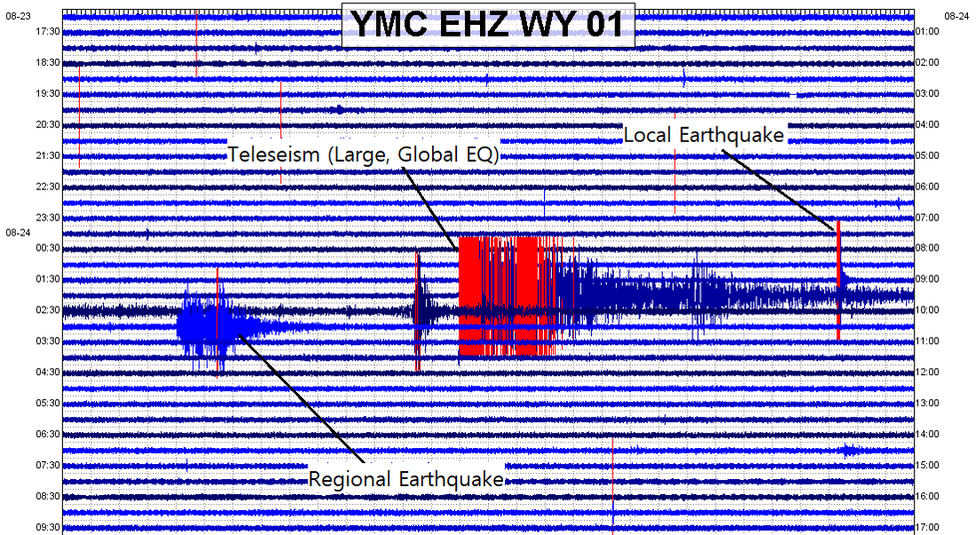
Station YMC resides in the northwest section of Yellowstone National Park, just outside of the caldera rim.
This day, August 24, 2018, was actually a good day to use as an example. Real quick, a teleseism is a large distant earthquake that typically occurs above magnitude 5.5 over 1,000km from the seismic instrument that recorded it. For example, a seismic recording at Yellowstone of the deep Fiji 8.2 earthquake would be considered a teleseism. The teleseism shown above occurred in Peru and was a magnitude 7.1 at 609km in depth! The regional earthquake, an earthquake which is not local but is not global as well, was a magnitude 4.3 that occurred in Colorado. A local earthquake is one that occurs somewhat near the seismograph in question.
It is actually easy to tell what is a large global earthquake compared to a local event. The farther from the epicenter you are, the farther the P and S waves will be from each other. S waves travel slower than P waves, therefore giving seismologists the ability to locate any earthquake (as long as they have at least 3 stations).
It is actually easy to tell what is a large global earthquake compared to a local event. The farther from the epicenter you are, the farther the P and S waves will be from each other. S waves travel slower than P waves, therefore giving seismologists the ability to locate any earthquake (as long as they have at least 3 stations).
A local earthquake to the NW of this station. Event: M1.7 at 4.8km in depth near Maple Creek.
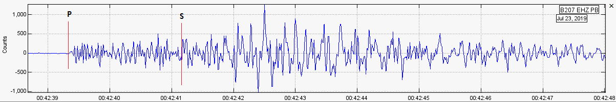
Those are the P and S wave separations labeled in the image above. To accurately locate an earthquake to the latitude and longitude, you must take 3 seismographs at the minimum and calculate the time difference between the P and S wave arrivals using seismogram (waveform) analysis. That is something you CANNOT do in any way unless you use seismic analysis software. Webicorder/helicorder plots are never, ever used for seismic analysis or earthquake location techniques. Never rely on webicorders/helicorders except for quick, simple overview.
Also, S waves are not surface waves. Sometimes distant large earthquakes can cause a third set of energy arrival called "surface waves". These can be characterized by either Love or Rayleigh waves. Love or Rayleigh waves appear to have low frequencies and very smooth waveforms.
Also, S waves are not surface waves. Sometimes distant large earthquakes can cause a third set of energy arrival called "surface waves". These can be characterized by either Love or Rayleigh waves. Love or Rayleigh waves appear to have low frequencies and very smooth waveforms.
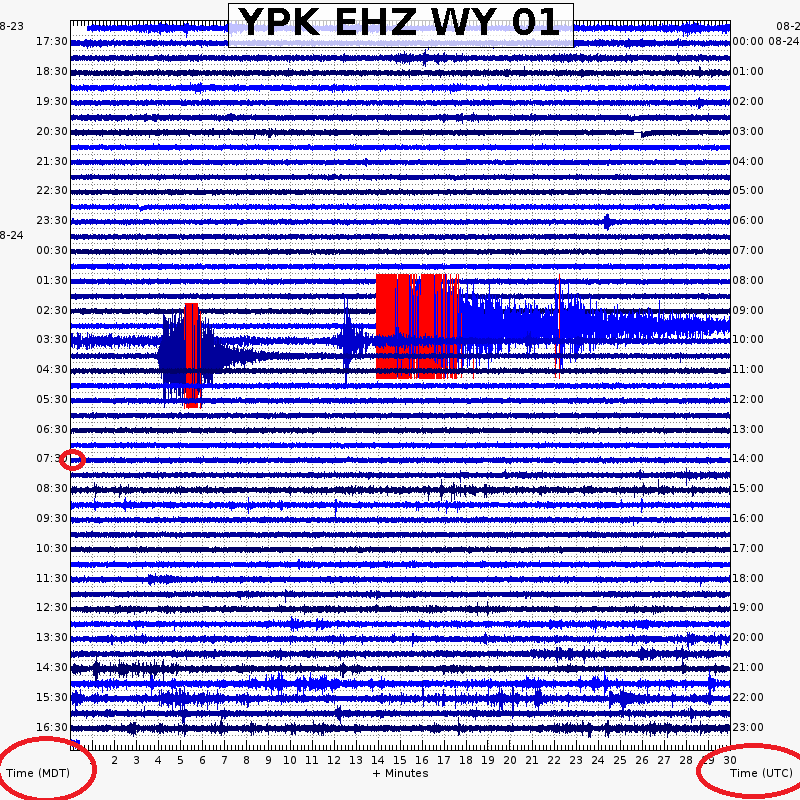
Station YPK is the eastern most seismic station in the WY network at Yellowstone, right on the border of the national park line.
Now let's use the above webicorder as the next example. The Alaska Volcano Observatory has a good explanation HERE as well in regards to how to read an online webicorder. With an online webicorder or helicorder, such as the one above, you read it as a book: from left to right - top to bottom. This webicorder shows a 24 hour period expressed by 48 lines with 30 minutes allotted for each line. These lines are also called seismograms. One line would be one seismogram, two lines would be two seismograms, and so on and so forth.
For the above example, there are three red circles. Notice them? The bottom two encircle the Time Zone type. The vertical numbers on the left are the times in Mountain Time (MDT or MST) and on the right is Universal Time Code (UTC). This can be different depending on network or location, so please always pay attention to chart labels FIRST before you read the data. For example, since I live within the Pacific Time zone, whenever I create helicorders it shows the time in Pacific time on the left, instead of Mountain time like you see with the Yellowstone webicorders. If you see a webicorder use GMT (such as the automatic Mt Rainier webicorders), it is the same thing as UTC. Need help understanding UTC since that is what seismologists use the most? Then please CLICK HERE for help. I try to explain it as best as possible.
Now, I want you to notice something interesting. Even though there are 48 lines, there are only 24 numbers (one per hour). It is easy to assume what will come next in the sequence when looking at each number. For example, it will show 17:30, 18:30, 19:30, etc... I'm pretty sure you can assume what fits between those numbers since it is 30 minutes per line!
Now, notice the third smaller circle at the 07:30 MDT mark? Well, where that line starts is where 07:30 MDT starts right? That is also were 13:30 UTC starts as well! Sound confusing? It kind of is at first. Something that really helped me a great deal was the timing of local earthquakes. Let's say a M4.0 earthquake occurred just 15 miles west of YPK, the seismic station used for the example above. Since the travel time of that earthquake should not exceed 5 seconds or so to reach YPK, you can use that as a guide. So I just kept comparing local earthquake times, that were confirmed by seismologists, with the time it arrived on the webicorder. I suggest if you are having trouble, please do that or email me or a professional.
-About the UNAVCO borehole instruments:
Seismographs simply record every single ground vibration, even 50,000 to 100,000 times smaller than what humans feel. This means if you were standing still directly next to a seismograph, and you felt complete silence and peace, the seismograph next to you could be detecting ground motion even from an earthquake that occurred 2,000km away! If you were to bend down and just slightly tap the monitor, it would show as a very large spike. Since seismographs detect ALL vibrations, surface noise is a constant hassle for seismologists. This is why some seismic monitors are placed below ground, sometimes at 300-500 feet (some slightly deeper), inside of a borehole. Now this is done to minimize surface interference. Borehole seismometers minimize surface noise greatly! But does it completely eliminate any and all possibilities of strong surface events appearing on the station? No, strong surface events are still possible. An example and info as to how and why that is still a possibility is shown in the video directly below if you wish to see proof. Please CLICK HERE to visit the video on YouTube so you can utilize the parts section in the description box, if you wish to skip to a part of interest.
Now, that being said, it is still possible to see surface noise on a borehole depending on borehole depth, amplitude of the surface noise in question, distance from the surface noise, and sensitivity. Yes! Those factors do play a major part in surface noise/surface events appearing on borehole seismic instruments. Sometimes the webicorders make it hard to distinguish from surface noise and actual seismic events. I tell you now it is not that hard to tell the difference if you cross correlate using seismic analysis software. If a true event occurs underground it will propagate away from the source in a sort of "circular" distance pattern, just like a ripple in a pond.
For example, when I first discovered this was on July 5, 2018 when I was first studying the July 5, 2018 West Thumb rapid-fire event. Even the tiny micro earthquakes (as small as M0.5) took only about 2-4 seconds to travel 14 miles, from YLT to YML, and appeared on multiple surrounding seismic stations. Now that is the opposite of what surface noise does! When surface noise occurs, it is pretty easy to tell since surface noise cannot travel 14 miles in 2-4 seconds! Well, unless the ground vibrations are from quarry blasts or some other type of extremely strong surface event. A great example are the surface vibrations created during an avalanche on Mt Rainier. Some strong avalanches can appear on seismic stations over 5-8 miles away! However, those are easy to tell apart since many of the events there are composed of surface waves and the strength of the events drop much faster than if they were occurring underground. It all depends on the characteristics. But remember, if it only appears on just one station, it most likely is surface noise. Even negative magnitude quakes can appear on multiple stations if they occur within a dense network (like the network at Yellowstone). However, sometimes they don't. Steamboat Geyser eruptions usually only show on one station: YNM. Cross correlation is very important in determining if an event was real or not.
For example, Yellowstone recently felt a magnitude -0.2 earthquake! Now that is extremely tiny! This micro-mini (as I like to call it), and many others, have been felt by these seismographs at Yellowstone. Surface noise, in most cases, will only show on the seismic station that was closest to it. Remember however, the stronger the amplitude of the event the further the vibration will travel. It is all dependent on a multitude of factors. Usually it is easy to distinguish between actual seismic activity IF you can view the waveforms in a small enough window. For example, it would be hard to tell the cause of an event just by looking at the online seismograms (U of U, MBMG, etc...) or spectrograms (UNAVCO, PNSN, etc...) since they contain too large of a time frame and do not give you the freedom to analyze it in the way that is necessary. Waveform and frequency analysis, with combined cross correlation of two or three of the closest neighboring seismic stations, is key in determining the difference between surface events and actual seismic events (trust me, it is much easier than it sounds). If an event occurs underground, it travels further than if an event were to occur above ground (of course unless a large nuclear bomb went off). The reason some people have avoided doing this is because they either do not know these possibilities exist or believe that it is very tedious, hard work. That is a lie. It may take a few days to get the hang of, yes, but it really is not that hard once you get the hang of it.
The image below shows the placement of the seismograph codes for YMC.
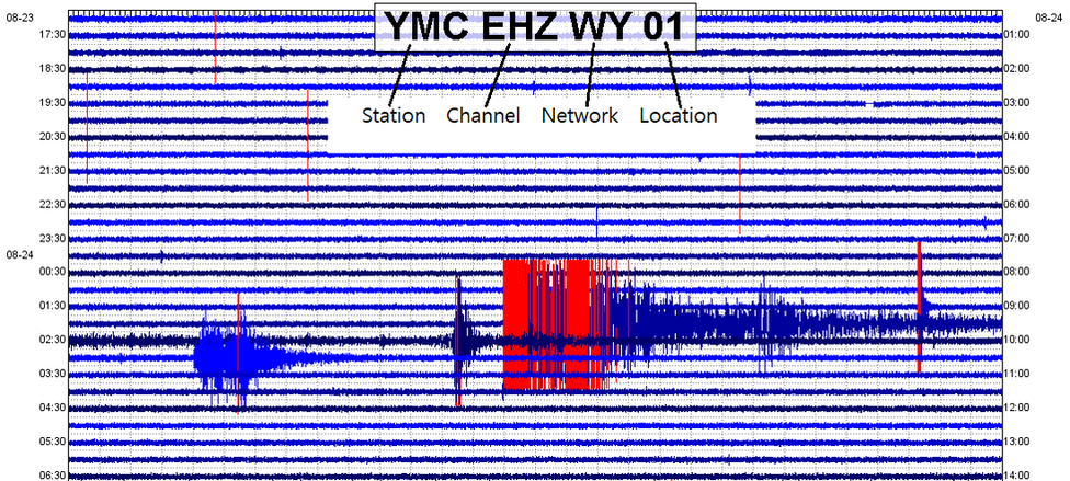
Random webicorder showing the placement of each seismograph channel code: network, station, location, and channel. The exact placement may vary from network to network, webicorder to webicorder.
The station codes above are very important, but are mainly used for locating stations and downloading raw seismic data directly from the instruments themselves. To understand why these codes are so important, please go to the "How To" drop down menu, and click "...download seismic data".
How to read seismogram/waveform plots:
If you wish to view the video version pertaining to this part of the page, please watch the video below.
Parts:
00:01 – Intro
00:40 – How to read seismogram/waveform plots
04:01 – Showing how data gets smaller when you add more data to the same sized plot
06:17 – Showing how waveforms can still show frequencies/Showing the different filter options
00:01 – Intro
00:40 – How to read seismogram/waveform plots
04:01 – Showing how data gets smaller when you add more data to the same sized plot
06:17 – Showing how waveforms can still show frequencies/Showing the different filter options
Waveforms are a very important aspect of seismological analysis. They can assist you in determining magnitudes, epicenters & hypocenters, earthquake types, different types of processes, and much more! I am not going to show you how to read waveforms specifically, but instead waveform plots. Waveform plots are also sometimes called seismogram plots. Now remember a seismogram is simply a line of data that was recorded by a seismic instrument, a.k.a. seismograph. Waveforms are what seismograms are made of. They show the way the ground moved in a particular direction, therefore assisting seismologists in determining causes of earthquakes and types of material below ground. Different types of seismic waves travel through material differently. This can aid scientists in discovering new pockets of magma, oil, or water. It can also aid seismologists in detecting very intricate processes that are taking place beneath our feet that would otherwise be hidden.
Now a short period station for example, EHZ, shows vertical ground motion. That means when you are viewing waveforms for a short period vertical channel, up would be ground motion heading upwards to the surface and down would be downwards motion. It also works the same way with horizontal channels. Remember horizontal channels usually end in either "E", for east-west ground motion, or "N", for north-south ground motion. An earthquake appearing on, for example, an "EHE" station would record ground motion that occurred horizontally towards the east and towards the west. Having EHZ, EHE, and EHN stations, when viewing earthquake waveforms, allows seismologists to gain a type of 3D perspective of the event in question, furthering their understanding of how the seismic waves propagated away from the source.
Now a short period station for example, EHZ, shows vertical ground motion. That means when you are viewing waveforms for a short period vertical channel, up would be ground motion heading upwards to the surface and down would be downwards motion. It also works the same way with horizontal channels. Remember horizontal channels usually end in either "E", for east-west ground motion, or "N", for north-south ground motion. An earthquake appearing on, for example, an "EHE" station would record ground motion that occurred horizontally towards the east and towards the west. Having EHZ, EHE, and EHN stations, when viewing earthquake waveforms, allows seismologists to gain a type of 3D perspective of the event in question, furthering their understanding of how the seismic waves propagated away from the source.
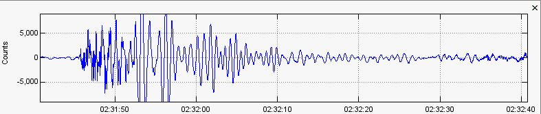
Possible magma resonance from the 2008-2009 Yellowstone Lake magma intrusion event. Seismic station US_LKWY_00_BHZ from December 29, 2008.
The image above is of a basic waveform plot. Waveforms are the most used type of seismic analysis. As always, please read all sides of the plot first before reading the data. Notice on the left, vertically, it says "Counts" and shows both 5,000 and -5,000? Those are the amplitude counts for what you see within the analysis window within those specific horizontal marks. Time frame is of course recorded horizontally on the bottom. Remember how I said earlier that you can rarely ever see waveforms using the online webicorders/helicorders basically because there is too much time per line within too small of an image? The incremental image directly below attempts to visualize this effect to you:
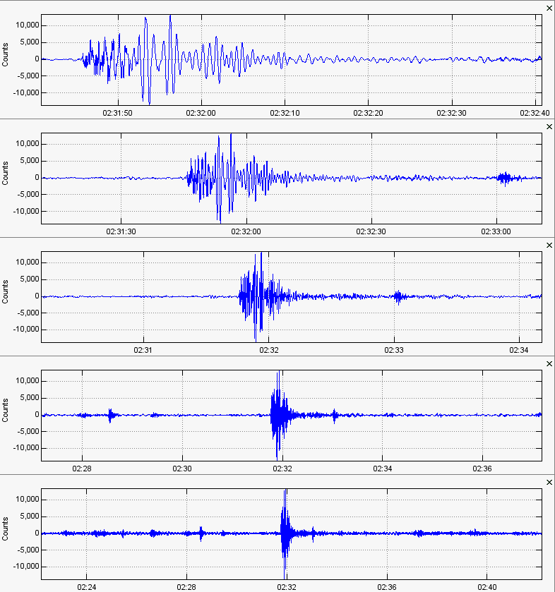
Here is an image showing 5 incremental steps as I used the program SWARM to "zoom out" using the waveform analysis window. Please note the time frame changes. For the record, this low frequency earthquake shown above is the same as the one in the image previously shown.
So notice how in the first of the five waveform plots it shows a total time period of about a whole minute? Also notice how the last of the five waveform plots shows a total time period of about 20 minutes? Well in the beginning you can see how spread out the waveforms are, allowing you to analyze this event and determine its characteristics. However did you also see how the waveform detail started to disappear only halfway down the image? At the end, this low frequency event looked like any other earthquake! But it was not like any other earthquake! This was done to visualize why the online webicorders should not be what you use to analyze seismic events. Again, the last waveform plot shows about a 20 minute time period. Most online webicorders, especially those from the University of Utah at Yellowstone, have 48 lines, in other words 48 seismograms, with 30 minutes per line constrained by pixels (because it is an image)! That is why seismic analysis software is a must when determining things. But I believe the reason most people, who are not actively creating a career in this field, have not done this already is because they think it will take far too much time and is too confusing to understand. At the time of writing this (Oct. 2018; updated late-Feb. 2019) I have only been analyzing seismic data for about 6-7 months. So it really does not take that long to understand and get used to these programs and how to monitor volcanic and tectonic hazard areas with accuracy! Now actually locating epicenters, determining magnitudes and earthquake causes, among many other things, are harder. However this gives you a big fighting chance!
So now you know how to analyze a waveform plot. As I said above, did you know that waveforms can actually show frequency content? It is true! That is also why frequency filters can be added to not only spectrogram plots, but waveform plots as well!
Another low frequency event that was identified during the Yellowstone Lake 2008-2009 dike intrusion event. If they happened before at Yellowstone, they can happen again! Data retrieved from seismic station US_LKWY_00_BHZ from December 29, 2008.
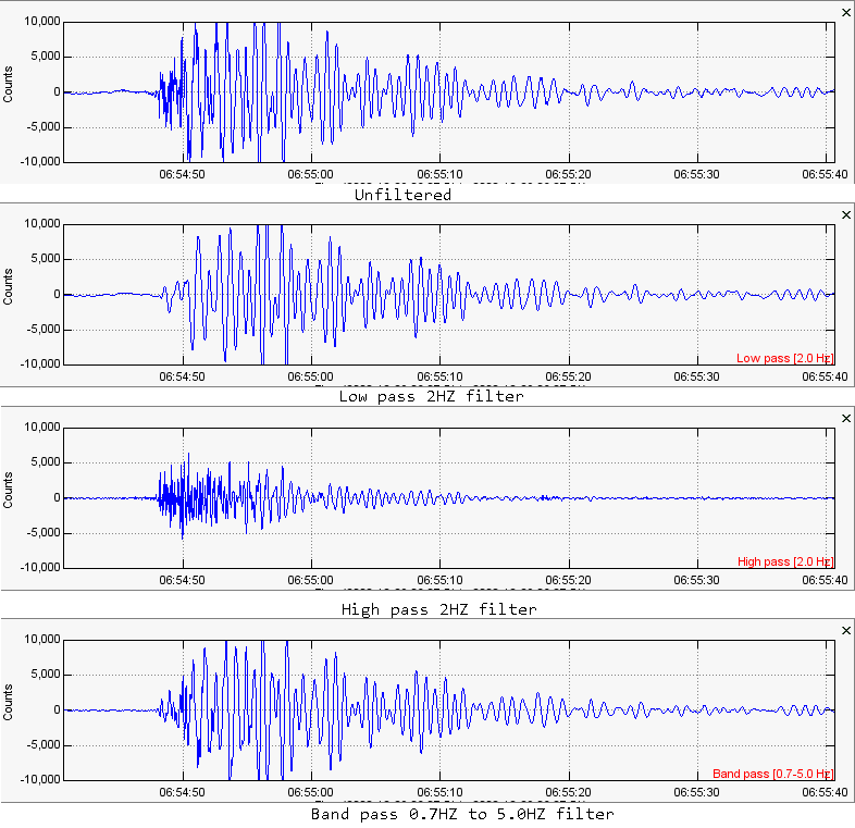
As you can clearly see above, waveforms can show frequencies! That is something I actually did not know until I started analyzing seismic data in July of 2018. The above image contains 4 waveform plots. All waveform plots are showing the same exact event but with a frequency filter. Frequency filters are helpful in filtering out certain frequencies you do not want to see. The frequency filter explanation given below is from the "...use SWARM" page within the "How to..." drop down menu:
"-Low pass filter: A low pass filter simply allows the user to view frequencies ONLY below what you want. For this filter option you only need to change the box that says "Max Frequency". For example if you have "enabled" and "low pass" selected and you enter 2.00 in the "Max Frequency" box it will only show frequencies below 2HZ and that is it. These are very simple to understand.
-High pass filter: This is similar to a low pass filter except that it works in exactly the opposite way. For this option you only have to worry about the "Min Frequency" text box. A high pass filter simply allows you to view frequencies above what you have selected. For example if you have "enabled" and "high pass" selected and you enter 2.00 in the "Min Frequency" box it will show all frequencies only 2HZ and above. Notice how it is exactly the opposite? Now what if you don't want either filter but want to set a frequency range of your choosing? If so, the band pass option is the one for you!
-Band pass filter: Now this one is easier to understand. This, when enabled, will allow you to see frequencies only in the range you have selected. This time you must pay attention to both text boxes (Min Frequency and Max Frequency). For example if you set 1.00 Min Frequency and 10.00 Max Frequency then, while viewing seismograms, spectrograms, or spectral analysis, it will only show frequencies between 1HZ and 10HZ. Starting to get the picture?"
I was very excited that such a thing existed when I found out! So the four waveform plots above show:
1. Unfiltered - This waveform plot contains no filter and shows all frequencies.
2. Low pass filter - With this filter added, and 2HZ maximum frequency set, the waveform plot only shows activity that occurred at 2HZ and below.
3. High pass filter - With this filter added, and 2HZ minimum frequency set, the waveform plot only shows activity that occurred at 2HZ and above.
4. Band pass filter - With this filter added, and 0.7HZ to 5HZ set, the waveform plot only shows activity that specifically occurred between 0.7HZ and 5HZ.
So I guess that settles that! Waveforms can show frequency content! This is another reason, among many others, that waveforms in conjunction with spectrogram plots and frequency spectra plots are very powerful to use during the analysis of seismic data. This is why I love the freedom of being able to download data from virtually any area I want during any time frame I want, and then being able to actually analyze that data any way I want! This truly gives people, who wish to monitor volcanic and tectonic hazard areas, alot of freedom. Now that is it for learning waveform plots. Did I forget to add something? Please let me know!
Last, but certainly not least, is how to read frequency spectra plots. This one is easy so it will be short.
How to read frequency spectral analysis plots:
If you wish to view the video version regarding the rest of this page, please watch the video below.
Parts:
00:01 – Intro
00:40 – How to read frequency spectra plots
04:57 – Amplitude scalings and clippings on a webicorder/helicorder (watch video further below)
00:01 – Intro
00:40 – How to read frequency spectra plots
04:57 – Amplitude scalings and clippings on a webicorder/helicorder (watch video further below)
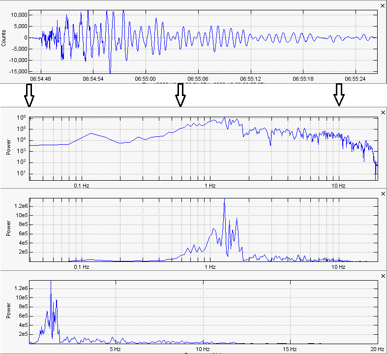
The image directly above shows 1 waveform plot and 3 frequency spectra plots for the same event. Frequency spectra plots are great, but are almost always used in conjunction with waveform plots and/or spectrogram plots. The 3 spectra analysis plots shown above are 3 different types you may encounter and are from the one waveform plot, of the low frequency event previously talked about, shown in the beginning of the image.
Frequency spectra plots are somewhat different than their siblings, seismograms and spectrograms. Both seismograms and spectrograms record data a little differently, however they both record time period horizontally. Spectra analysis plots actually do NOT record time frame. They simply show you the power and frequency of the entire time period you have selected, in this case the entire time period from start to finish of the waveform plot given. They record frequency horizontally and power vertically. There are a few different ways you can view the spectra analysis window in SWARM.
-The first spectra analysis shown is less used by me. It is achieved by having both "Log Power" and "Log Frequency" checked within the Spectra settings within Wave settings in SWARM. I prefer using the last two types of spectra analysis.
-The second spectra analysis plot shown is achieved by having "Log Power" unchecked and "Log Frequency" checked within the Spectra settings. I do not know what they mean though by "Log Power" since it still records power vertically no matter what. It wouldn't be spectra analysis without recording power! This is what I use the most for lower frequency activity. You can easily tell by looking at the spectra plot that this event was a low frequency event with dominant frequencies between about 1-2HZ. The lines they provide are helpful.
-The third spectra analysis plot shown is achieved by having both "Log Power" and "Log Frequency" unchecked within the Spectra settings in SWARM. This is a popular version of a spectra plot and I use this for more higher frequency activity. Actually, I use them in conjunction with each other. Again it records power vertically and frequency horizontally allowing you to identify dominant frequencies. When viewing an event with frequency spectra analysis, I like to use the top 3 spikes I see to determine dominant frequencies. The most dominant frequency will be the one with the largest spike.
And that is it for this page so far! We learned how to read online webicorders/helicorders and how to read the multiple different types of seismic plots you will encounter in your endeavors. We learned waveform/seismogram plots record amplitude (the power of ground motion) vertically, time period horizontally, and frequency. We learned spectrogram plots record frequency vertically, time period horizontally, and the color range from blue (weakest) to red (strongest) is power (decibels, dB, as shown in the program SWARM). We also learned about the multiple different types of spectra analysis plots, but also that spectra analysis does not record time period horizontally but records power vertically and frequency horizontally for any time period you select for the analysis window.
I hope these explanations helped and this page will be added to here and there as new information or seismic analysis changes come to light. Thank you for learning with me!
I hope these explanations helped and this page will be added to here and there as new information or seismic analysis changes come to light. Thank you for learning with me!
What are the red marks on online seismic charts? Why do the size of the events seem to change when bigger activity is seen?
Well to start, there is such a thing called re-scale. The data itself is never manipulated, but only how it looks. Some online webicorders use this and when you see a large 4.0 or so quake strike near Yellowstone, you will notice some of the smaller quakes (that would usually look bigger) look smaller. I used to think this was done intentionally, but I then realized it was an automatic response to incoming data that was much larger. This is called re-scale and can be done in many different ways on the program SWARM (or completely removed if you wish).
Now the red marks you may see on any helicorder or online webicorder are amplitudes that have been clipped because they went beyond a pre-set margin. This is so smaller activity is not completely hidden by large "spikes" many earthquakes can produce. However BEWARE! These marks are not for earthquakes only! Any amplitude, regardless of the source that goes beyond the pre-set setting, will be cut. Whenever it is cut, it is marked in red to notify you the amplitudes have been cut on the chart. Please note that this does not affect the data in any way, shape, or form. If you would like a few examples, please watch the quick 3 1/2 minute video directly below. There is no sound but there is text so you will understand what is going on.
Now the red marks you may see on any helicorder or online webicorder are amplitudes that have been clipped because they went beyond a pre-set margin. This is so smaller activity is not completely hidden by large "spikes" many earthquakes can produce. However BEWARE! These marks are not for earthquakes only! Any amplitude, regardless of the source that goes beyond the pre-set setting, will be cut. Whenever it is cut, it is marked in red to notify you the amplitudes have been cut on the chart. Please note that this does not affect the data in any way, shape, or form. If you would like a few examples, please watch the quick 3 1/2 minute video directly below. There is no sound but there is text so you will understand what is going on.
Is anything missing from this page or is there a mistake? Please contact me and I will change it immediately once the mistake is confirmed.